
New in Basecamp: A refreshed project page and more
We've added lots of big features to Basecamp recently, like Timesheet and References, but it's important to polish the small details, too. So, we looked at a few key pages to see what could use a touch up. Here are the improvements you'll see:
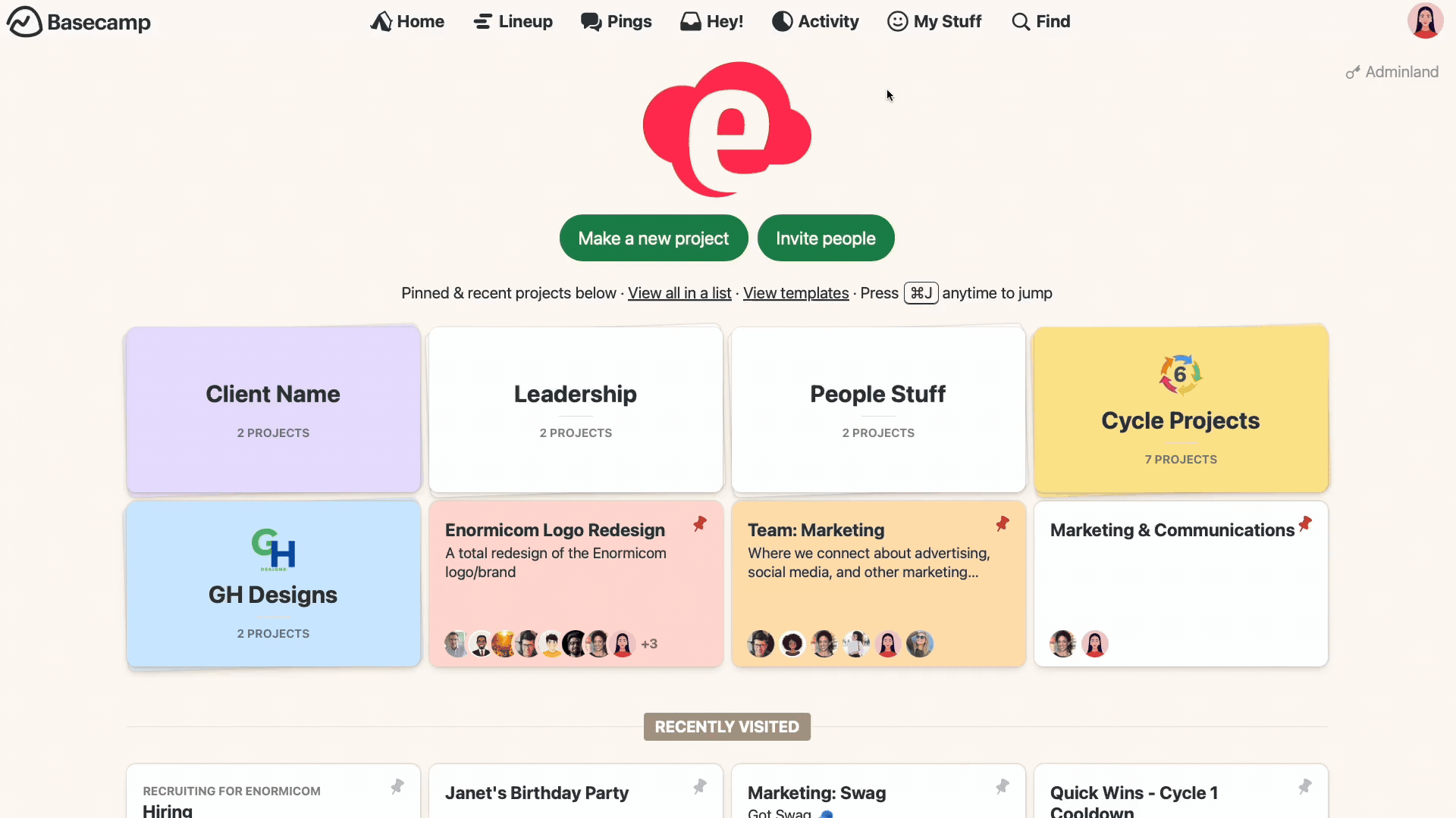
A more organized project page
You can easily see the status of your project with Move the Needle and Lineup. With these features enabled, though, the top of the project could feel a bit cluttered. We rearranged some things to make it better. The project's name and description are now anchored to the top so they don't get overshadowed, and we grouped the project gauge and start and end dates together — nice and tidy!

The project tools got a little tweak, too. We extended them from edge to edge, making more room for the work. We also added a subtle background color on the tool previews.

New projects shine, too! We refined the icons, colors, and descriptions that you see on a fresh project and added buttons to clarify the next steps.
Streamlined access to reports
When you want to see someone's assignments or review overdue to-dos, you head to the Activity page. We've added several new reports, including Mission Control and Unassigned Work, and that Activity page was getting crowded! To keep the focus on the report you're viewing, we gathered the rest into a single dropdown menu.
Adminland
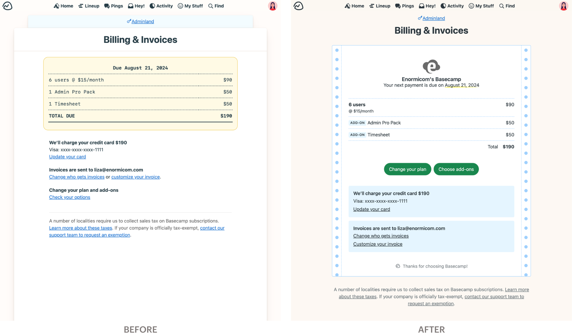
Who says invoices have to be boring? We gave our Billing & Invoices page a fresh coat of paint, complete with a throwback, dot-matrix style design. Links to change your plan are front and center and everything is clearer.
You may notice some other tweaks throughout Basecamp, like better aligned content and a subtle color palette update for better accessibility.
We hope you find these small refinements to be a big improvement.
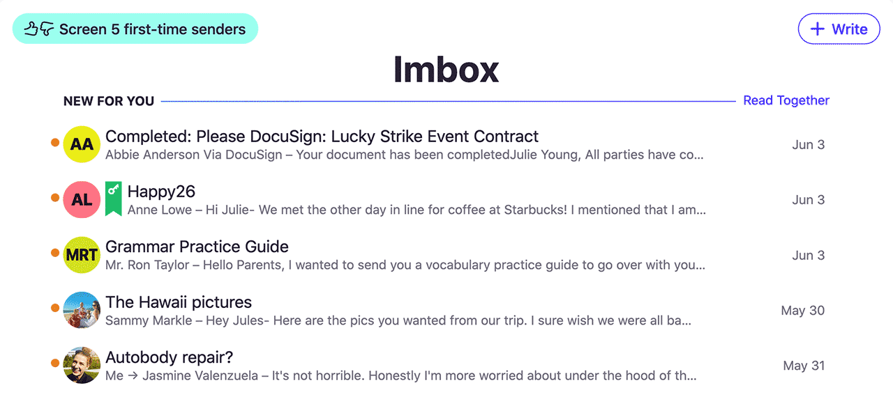
Email’s new heyday
Email sucked for years. Not anymore — we fixed it. HEY’s fresh approach transforms email into something you want to use, not something you’re forced to deal with.
Try HEY free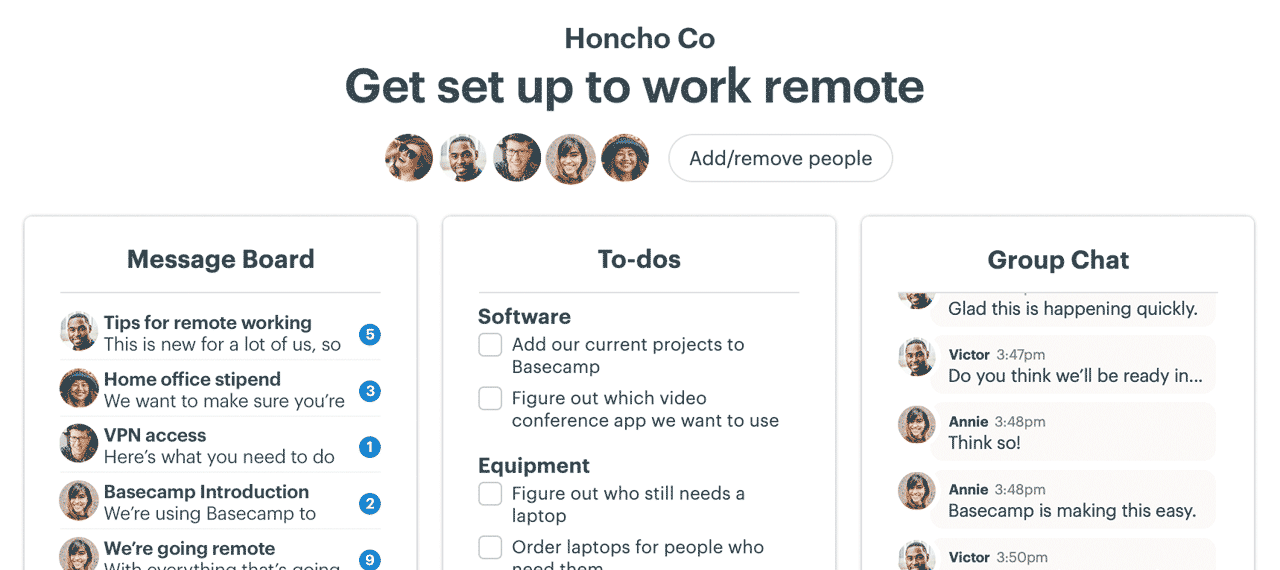
Tried Basecamp lately?
Used an earlier version, but moved on? Heard of it, but never signed up? Today’s Basecamp will surprise you! It’s all-new, entirely modern, and unlike anything else.
Try Basecamp free