NEW: Refined Home Screen, Participation Types, and more
The process of evolving Basecamp 3 into Basecamp 4 continues with the launch of another collection of great new features. Let’s get into what’s new:
Refining the Home Screen
In January we shipped a number of updates to the Home Screen. For the most part the changes were well received, but we also heard from a number of customers who wanted us to go a bit further. It was great feedback. So over the past few weeks we’ve been working on some additional changes based on that feedback. And today, they’re live.
A better directory list view. First, we’ve added a number of filters to the list view. Now you can see everything, just pinned stuff, just projects, just teams, just projects with clients, and another view that combines archived and deleted projects. You can live-filter each view as well. It’s snappy, it’s useful, and it lets you easily hone in on exactly what you’re looking for. We also made it easier to get to by moving the link to the list view up above the cards, rather than below them. Now you don’t have to scroll past anything if you just want to pop into the directory view.
A better organized card view. We took the original concept, and added a layer of compartmentalization to make it easier to see what you’re looking at. Now pinned teams and projects get their own dedicated section at the top of the Home Screen, and, below that, you’ll see up to 20 of your most recently visited teams and projects. The pinned section at the top can be reordered and organized how you like. It’s fixed, and predictable. The recent section down below, is fluid and relevant based on what you’re visiting, viewing, and accessing. It’s the best of both worlds, and we think you’re really going to like it.
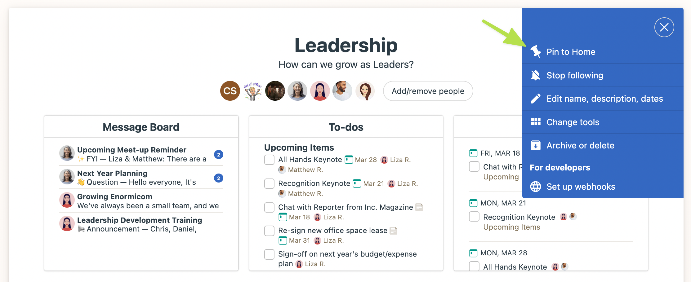
And one more thing related to home. Now you can pin a project from within the project itself, not just from the home page. When you’re on a project, click the ••• menu top right and you’ll see a new option to pin.
Participation Types
Different companies have different norms when adding people to teams and projects. Some keep it really tight and only add the people who are working on the team or project. Others add anyone who wants access, or everyone at the entire company. For example, at Basecamp, we typically add nearly everyone to everything so there’s full visibility into what everyone’s doing.
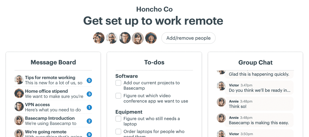
However, there’s a real downside when you add everyone to everything — it’s not clear who’s actually working on that project, or just following along. Instead you just see a long strip of faces across the cards on the home page, and at the top of projects. Maybe just 6 of the 28 people on a particular project are responsible for that project, but you’d never know from just looking at the faces.
So we set out to fix this — to add a dose of optional distinction between those are really working on something, and those who are just following something. We call this new feature Participation Types, and it shows up in two ways in a few places.
Now when you add someone to a project, you can mark them as Working On the team/project, or Just Following.
If someone’s Working On, their avatar will show up on the home page card, the lineup card, and at the top of the project. This way when you see faces associated with teams/projects, you’ll know they’re the people who are actually woking on the thing. They’ll also be placed in the “Working On” notification group, so you can only notify that group when you post a message, write a document, or link up a file. People who are working on will also automatically be subscribed to Campfire chat notifications in that specific team or project.
If someone is Just Following a team/project, it’s a quieter experience. Their face won’t show up on the card or at the top, and they won't be subscribed to the Campfire chat room in that project either (although they can subscribe themselves if they want). This keeps notifications down to a minimum, and allows people who just want to follow along to work without being distracted by things they don’t necessarily need to know about as they happen.
You can set the Working On / Just Following toggle per-person from inside a project on the people screen, and you can also set it in bulk when adding people to multiple projects at once from Adminland. This is especially handy for adding new employees to your company. We recommend adding most people as Just Following, so they don’t get overwhelmed by notifications for projects they aren’t really “on”.
These two options may take a moment to get used to, but we think they map well to real world cases and requests we’ve been hearing from customers for years. Try them on for size!
Also, note, everyone who was already part of a project before this update will automatically be set as “On the Project”. You can of course make any changes you need from the People screen inside a project, or in bulk via the Adminland screen.
More room around the Campfire
When you’re in a Ping or Campfire chat you’ll notice there’s a new “A” icon next to the emoji and file attachment icon on the right side of the text field. Clicking this “A” will expand the field into a multi-line field and expose formatting options. Now you can write longer pings/chats and add bullets, bold, etc. When you’ve composed what you want to send, just click the “Post” button at the bottom. If you want to return to the single line instead, just click the “A” icon again.
———
We hope you love the stuff above.
There’s one more thing that’s coming soon, but not part of this initial batch of new features. Give us a couple weeks, and we’ll be back with an announcement.
Cya soon!


