NEW: New Home Screen, The Lineup, Doors, and more
It’s the first week of the new year, and we’re dropping a huge set of exciting new features into your Basecamp account. Remember, this is all part of the process of upgrading Basecamp 3 to Basecamp 4. In a few more months, after some more big upgrades, we’ll have completed the transition.
Until then, let’s get into the brand new stuff shipping this week…
The New Home Screen
We previewed this one a few weeks ago, and now it’s here, live in your account right now. It’s familiar, but there’s a lot that’s new. First, let’s take a look:
We’ve cleaned things up considerably. We no longer favor the HQ or Teams over Projects. Everything shares the same space now. Your HQ and Teams are marked with little indicators, and everything else is a project. You also have a single button to create a new project or team — before we had multiple buttons spread in a few places. The single button simplifies things, and the subsequent screen does a better job explaining the difference between teams and projects on creation.
Second, we have 12 dedicated slots that automatically show the most recent teams and projects you’ve visited. This makes the top more relevant, and not just an alphabetical collection. Want something to stick around? Just pin a team or project to lock it to the top, and now you can even drag-and-drop reorder your pinned items so they’re just right. And if you choose to pin more than 12, you can do that too. Below the Dock (that’s what we call the spaces for the Teams and Projects) there’s a single link which takes you to a simple A-Z list of all the Teams and Projects you have access to, not just ones you’ve pinned or recently visited.
And down below, we have two columns just for you: Your Schedule and Your To-Do Assignments. Always quickly accessible, always up to date. Now Home is more for you and your specific stuff, and not just big picture things like Teams and Projects.
Overall, this Home Screen redesign is a vast simplification, but also a more powerful rendition. Plus, we’ve optimized the design for small and big accounts alike by dynamically resizing the cards based on the number of Teams and Projects you have. Give it some time for the changes to sink in — we think you’re really going to love it once you get used to it.
The Lineup
Ooh, here’s one you probably never saw coming. And it comes in two parts.
Part ONE: Now you’ll be able to add start and end dates on projects. We show the dates span right at the top of the Project, so everyone knows when the whole thing is due. A vertical green line marks today, which helps you get a sense for how much time you have left. Start and end dates are only available on Projects, not on Teams, since the Marketing Team is something your company always has, while a specific Marketing Project starts and ends.
To add start and end dates on a project, click on the ••• menu at the top right of a project and select the “Edit name, description, and dates” option. Then add the dates to the “Project Schedule (optional)” section. Once you do, you’ll see this:
Part TWO: Now that we have dates on projects, we can plot those projects on a visual timeline! We call this The Lineup. And it’s killer. It looks like this:
How’s it work? First, you’ve got Today, always centered, with a vertical line running down the screen. Any dated Project that's ongoing (one that has a start date before today, and an end date after today) is plotted on the timeline with a big white box, similar to the Project boxes on the home page. And future projects that are coming up, as well as past projects which recently completed, are also plotted in a more muted, thinner style. The past, present, and future are now in view, telling you which Projects are currently in play, which recently passed by, and which ones are coming up.
Before The Lineup, it was hard to know which projects were in play, which ones were coming up, how much time was left on what, and who was working on what. Now, once you slap some start and end dates on said projects, you’ll get a great at-a-glace view, all on one screen, of what the company was focused on, what it’s focused on now, and what’ll it’ll be focused on soon.
We think you’ll get a lot out of The Lineup. We’re thrilled to bring it to you.
Doors
Even though we manage all our teams, projects, bug tracking, executive decision making, social connections, internal communications, and nearly everything else using Basecamp, we also use Github for code, HelpScout for customer service, Zoom for the occasional video call, etc. Doors are a recognition that there’s a rich and wonderful world of other tools that people use in conjunction with Basecamp to get their jobs done.
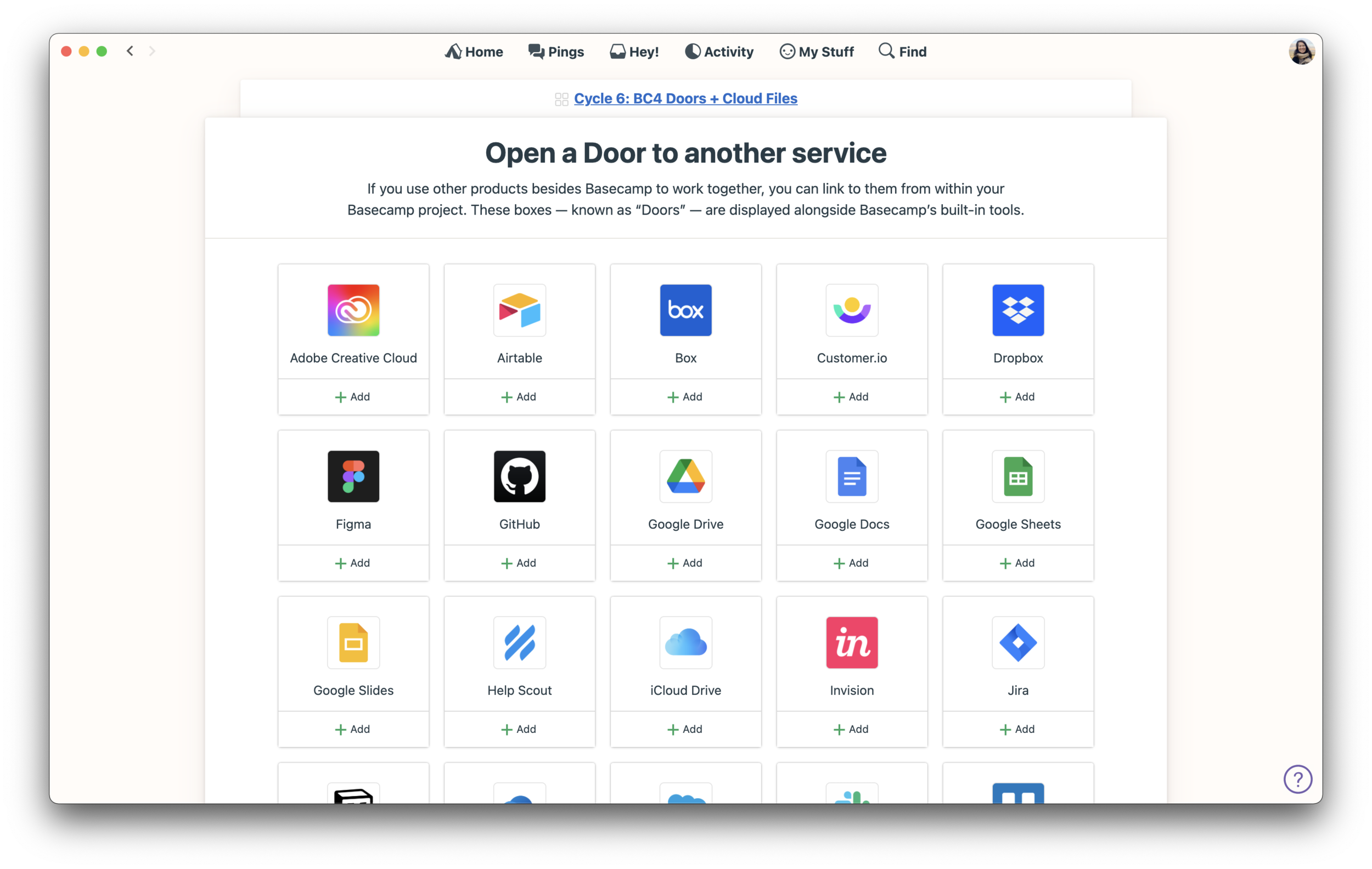
So what’s a Door? A Door is a link to another app, product, or service that can be displayed alongside Basecamp’s built-in tools on a Team or Project’s main screen. So you could have a Project with To-dos, a Message Board, a Schedule, a Campfire Chat room, and a link to a GitHub Repo. Or, you could add a Door to your HelpScout account on your Customer Service Team’s Basecamp Team page. Or the Design Team could add a link to an ongoing Figma project on their Team page. And so on. You can add as many links as you’d like to as many services as you’d like. And if we don’t have a dedicated Door for the other service you use, drop us a note and we’ll either add it, or you can use the “Other” option to link off to any other service you’d like that we don’t cover.
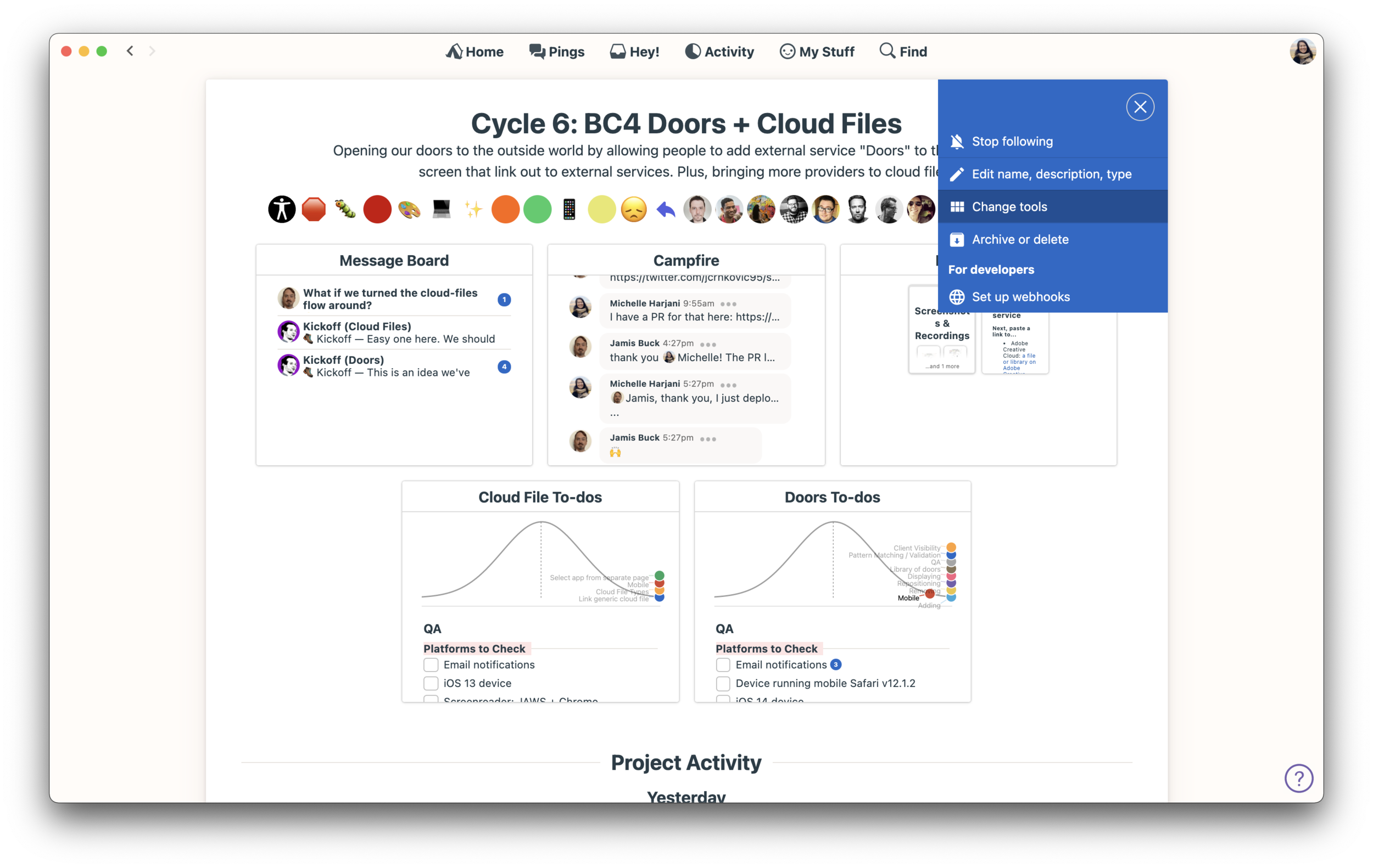
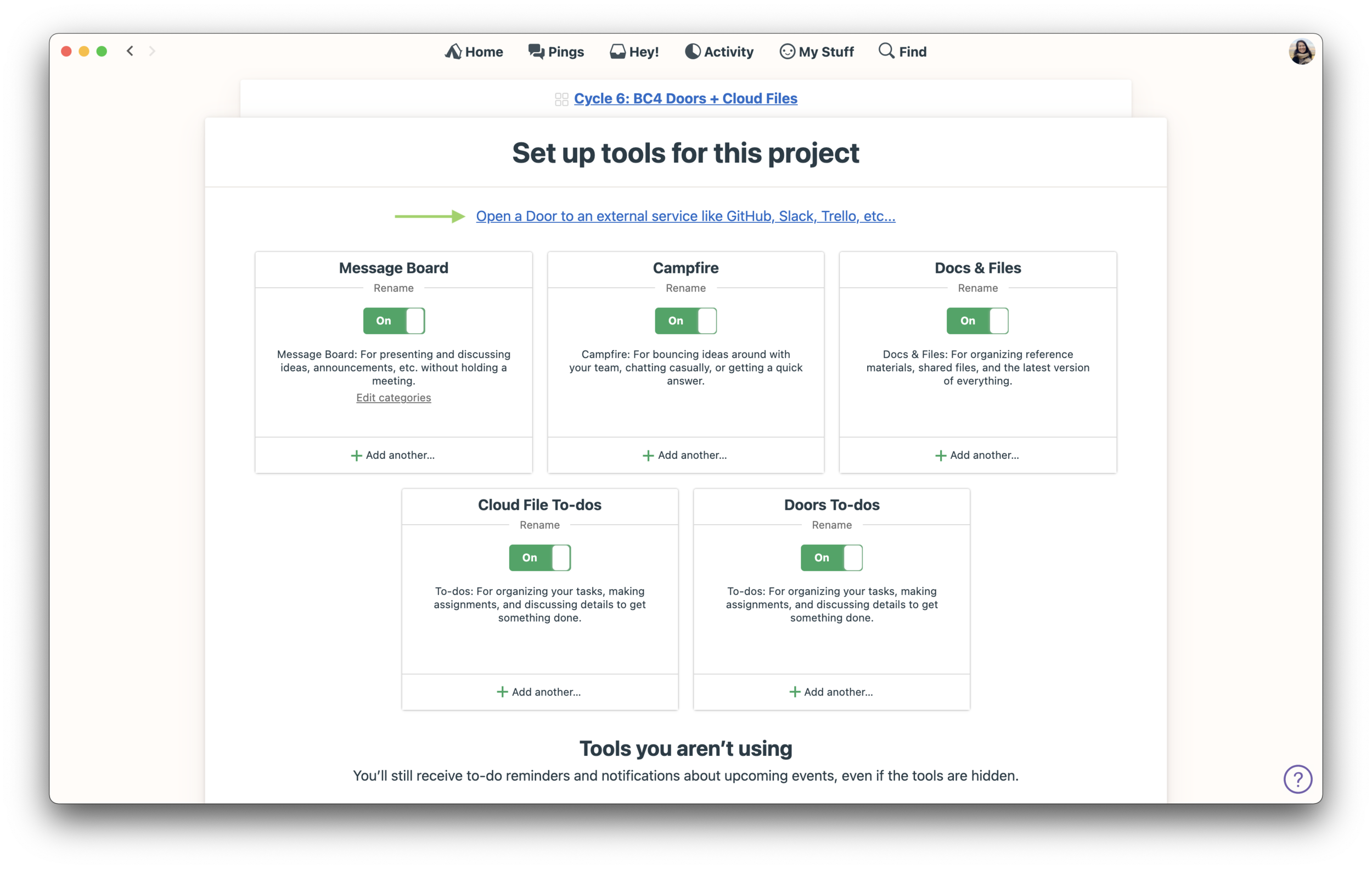
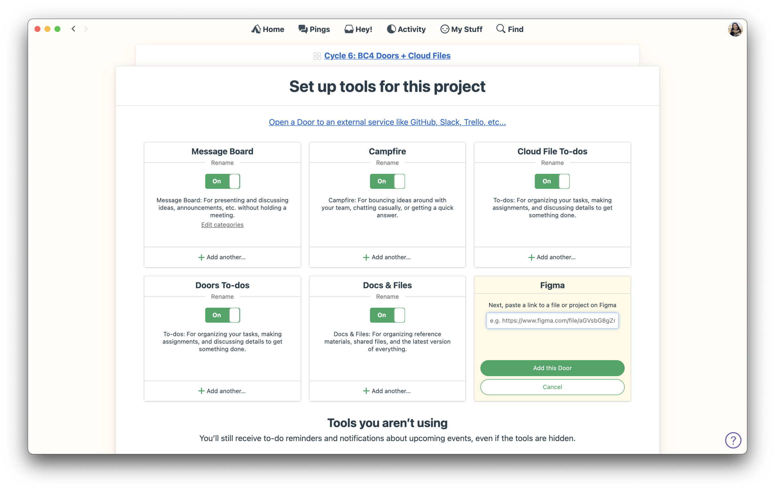
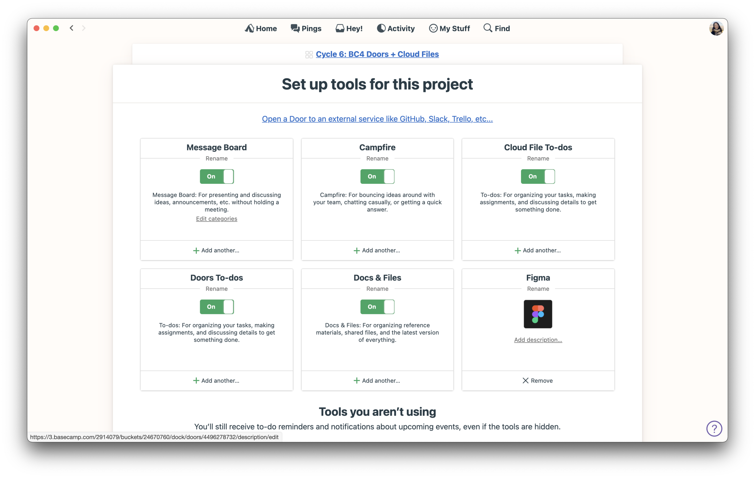
To add a Door to a project, click on the ••• menu at the top right of a project and select the “Change tools” option. Then click the “Open a Door to an external service…” link near the top of the screen. Then click the “+ Add” button below the Door you want to add, paste in a link, and you’re done. You can add a description afterwards or rename the Door as well.
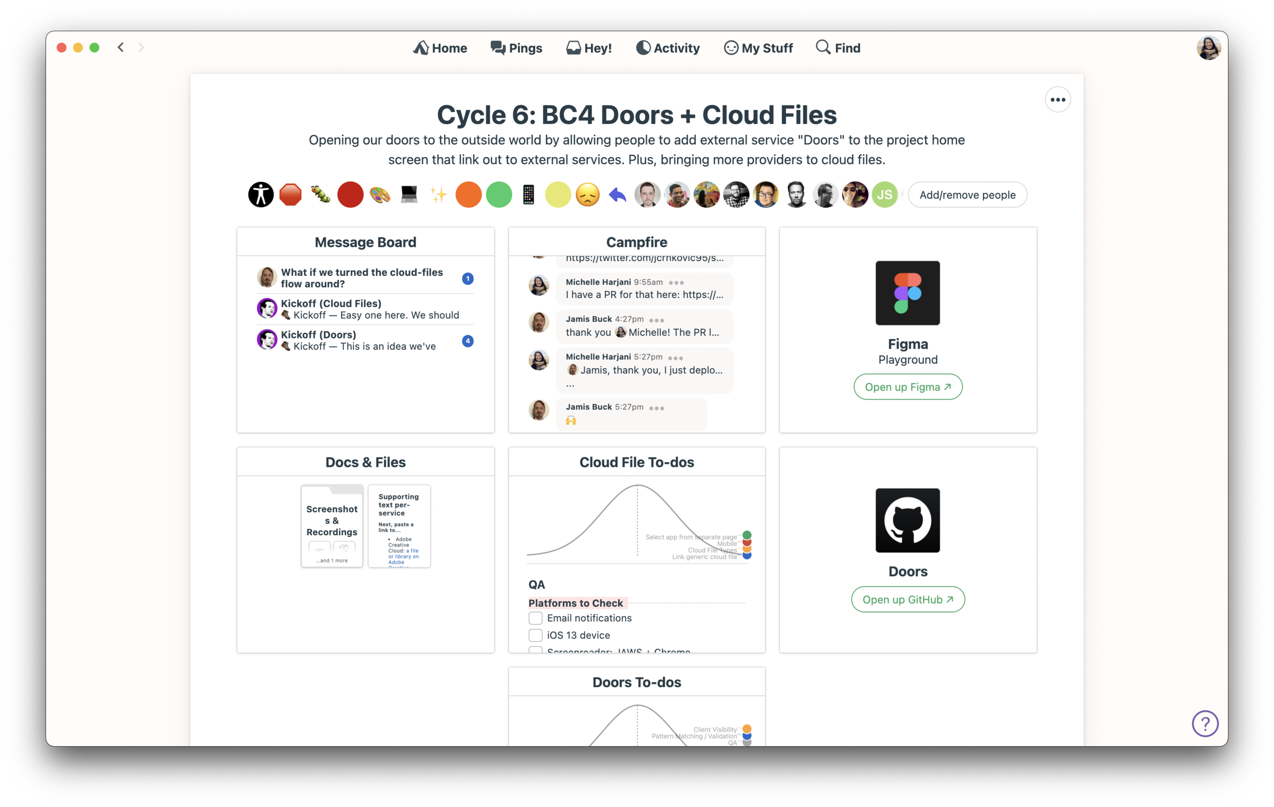
You might be wondering if these integrations go deeper than direct links to other services. Right now, they’re just branded links. We aren’t pulling their data into Basecamp, or sending any data to them, and you aren’t using their tools from within Basecamp. When you click a Door, you leave Basecamp and go to the other service’s app or site. One day we may offer some deeper integrations like we do with Campfire Webhooks, but for now, Doors are simple links.
Really curious to see how people use this one!
Cloud Files
We’re not done yet! In addition to Doors, we also added a long list of third-party services to the Docs & Files section in your Basecamp Teams and Projects. Before this release, you could only link up Dropbox, Google, Box, and a few other services. Now you can also link up cloud files stored on Airtable, Figma, iCloud, Invision, Notion, Zoho, among others. There’s also the “Other” option if we don’t have a dedicated option for the service you use.
Out of Office
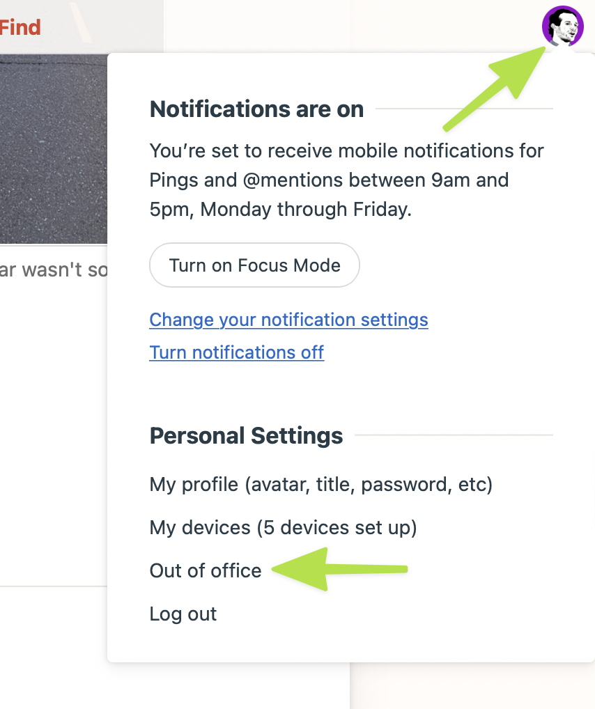
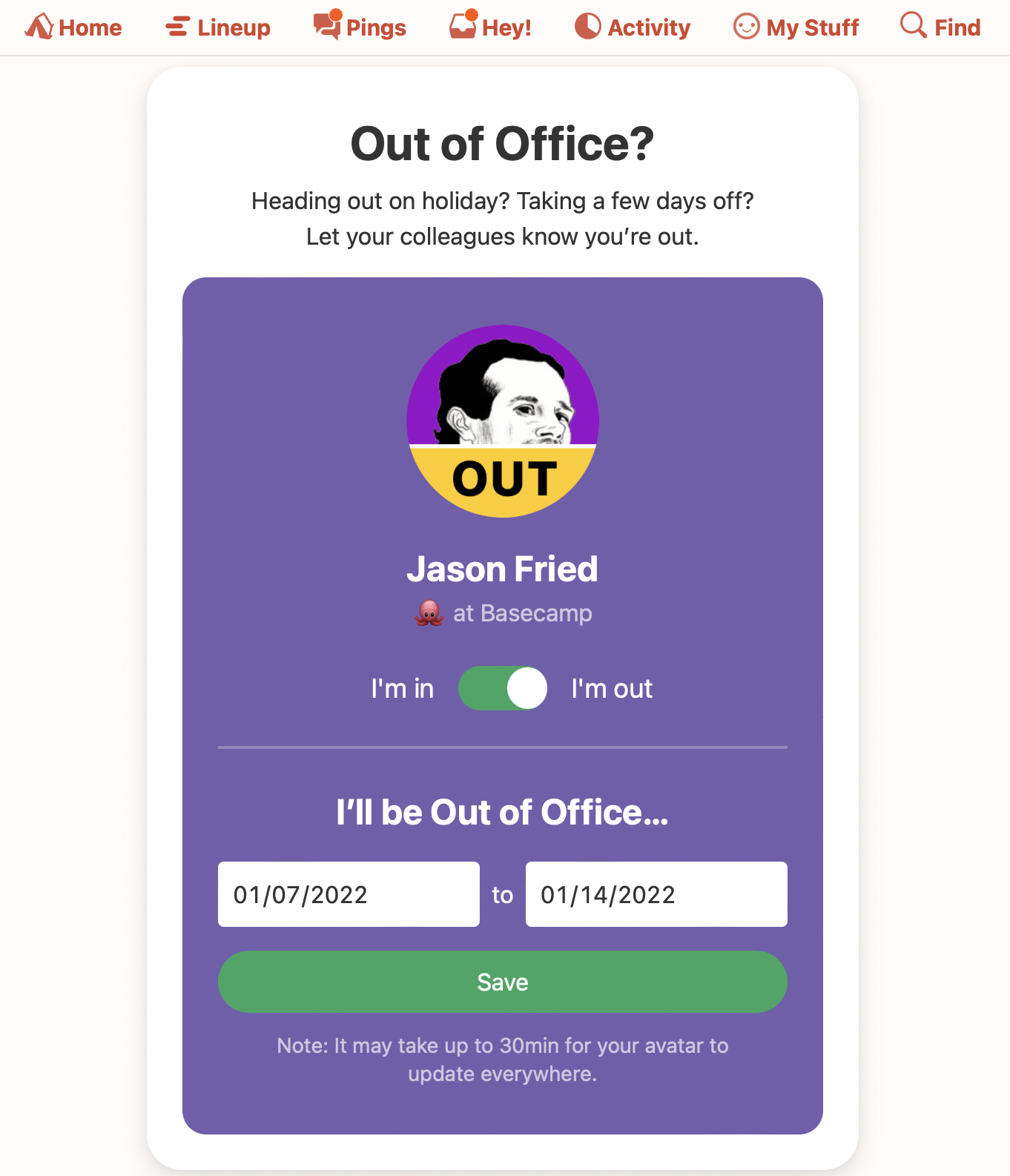
Headed out on a trip? Taking some time away? Need to communicate to the rest of the team that you’re out for a while? Now it’s easier with Out of Office. Just go to your avatar in the top right, and select the new Out of Office option. Then toggle the “I’m in” control to “I’m out”, select the date range you’ll be out, and “OUT” will appear on your avatar everywhere in Basecamp. People will also see which days you'll be out if they try to @mention you, or assign you a to-do as well.
Encryption
While this feature isn’t customer-facing, it’s a huge upgrade on the back-end for your personal privacy, project privacy, and company privacy. Basecamp now encrypts your chats, messages, comments, to-dos, documents, and other content in your account. If you’re technically minded, you can read Jorge’s write-up on the update.
—
That’s a lot of new stuff for a brand new year. And we’re just getting started. Basecamp will continue to improve, every 6-8 weeks, all through 2022 and beyond. Lots ahead!
Thanks again for your continued support. And Happy New Year from everyone here at Basecamp. We hope 2022’s off to a great start. We wish you continued success.
—The whole team at Basecamp


